The short answer to this often asked question is that "it is believed to be an authentic period colour scheme".
Armathwaite signal box was constructed in 1899 by the Midland Railway Company and, at that time, its standard colour scheme for painting signal boxes was:
- 'Venetian Red' for the structural frames;
- 'Lemon Chrome' for the wall panel in-fills;
- white for the window frames; and
- white lettering on an 'Ultramarine Blue' background for the name board.
However, while there is general agreement on the above in principle, things are not that simple in practice. For example:
- There appears to be no definitive specification for these colours that can guarantee accurate reproduction today using either traditional or modern ingredients.
- Due to slight variations in raw materials and production processes, it is possible (perhaps even likely) that the exact hue of the three non-white colours would have varied from manufacturer to manufacturer and perhaps even from batch to batch.
- When paint is first applied, the perceived colour can be affected significantly by both the underlying colour (e.g. the bare timber, primer, undercoat and / or previous top coat) and the thickness & evenness of the paint application.
- Exposure to sunlight, rain, pollution, etc. can significantly change the measurable and perceived colour of a painted surface over time.
- Every person perceives colours slightly differently.
Bearing in mind all of the above, the volunteers responsible for maintaining Armathwaite signal box have chosen what they believe to be the best approximation for the original colours that is currently possible using modern paints. We asked Dave Harris[1] (who has been recording and researching Midland Railway signal boxes for decades) for his thoughts on the accuracy of these colours. His reply was as follows:
As far as signal boxes are concerned, I am quite sure that the lemon chrome and venetian red may have started off as garish as portrayed here, but crucially, unlike modern paints, they would have absolutely no ultra-violet resistance. As such they would very quickly fade and, on a steam railway, get grubby at the same time. I’m not even sure that modern microscopic examination of paint flakes really takes us very much closer to how the freshly applied pigment would look.
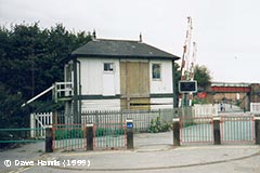
... While most of this is supposition on my part, I do in fact have a small piece of evidence to back it up. Way back in 1999 I had occasion to photograph Sneinton Junction signal box (Nottingham). An advertising hoarding which had evidently been in situ on the back of the box for many years had recently been removed. At the time I didn’t have the requisite background knowledge to think anything of it and so other than accidentally recording it in this snap, did no more about it. Only years later did the penny drop that this had revealed the original MR lemon chrome paintwork. Of course even this is of limited value; the ambient brightness on the day, the camera settings, the printing and scanning process etc. (it was taken pre-digital) will all combine to make this image far-from-definitive.
... So, in summary, I think the explanation you currently give is entirely correct, but with the qualifier that while this is how it would have looked the day the painters left, it would have “toned down” a lot by now had Victorian paints been applied.
Bearing in mind all of the above, the colours used today are the best approximation for the original colours that is currently possible using modern paints.
Further reading
The 'Structures and lineside' section of an article entitled "Midland Railway liveries: some facts about paint" on pages 51-52 of the preview issue of "Midland Record" (published by Wild Swan Publications in 1994).
"Midland Style", written by George Dow and published by the Historical Model Railway Society in 1972.
Footnotes
[1] Dave Harris is the owner / webmaster of the Derby Signalling website, the Study Centre Co-ordinator for the Midland Railway Study Centre in Derby and the Secretary of the Midland Railway Society.

